SparkClouds
Information Visualization
Jamie Hand and Aayam Poudel
What is a SparkCloud?
A SparkCloud is a tag cloud with sparklines incorporated along with
each word. It was a result of Microsoft Research conducted by
Bongshin Lee, Nathalie Henry Riche, Amy K. Karlson, and Sheelagh
Carpendale. The purpose of SparkClouds is to let people see how tag clouds
change over time.
The source code for the implementation, including the Python scripts and
SOTU text files used to generate our dataset, can be found
on GitHub.
Evaluation
SparkClouds, like all other visualizations, have pros and cons.
Pros
They let users compare multiple tag clouds without having to see them separately.
They make it convenient to see how text samples change over time.
SparkClouds make the visualization compact and less cluttered compared to
alternatives. Scrolling is usually not necessary, and everything can be made to fit onto
one screen.
Identifying words is fast, and users can easily get a big picture of the data without interaction.
Finally, color could also be used in the visualization to encode other things.
Cons
The lack of x-axis labels forces
users to guess which time period (e.g. month) is represented.
That is, accessing specific time and other details in the data would
require interaction or something similar.
The y-axis is normalized for each word, which makes it difficult to compare
frequency between words (except by size of word, which is less precise).
The position of a text on the screen means nothing, which means we're
using the most powerful visual variable without it conveying anything meaningful.
Furthermore, long words inevitably get more attention than short words of the same
frequency, which might give a slightly wrong
impression about the data.
Finally,
SparkClouds are a very specific type of visualization, which can only be
used for word-based or tag-based datasets.
Summary
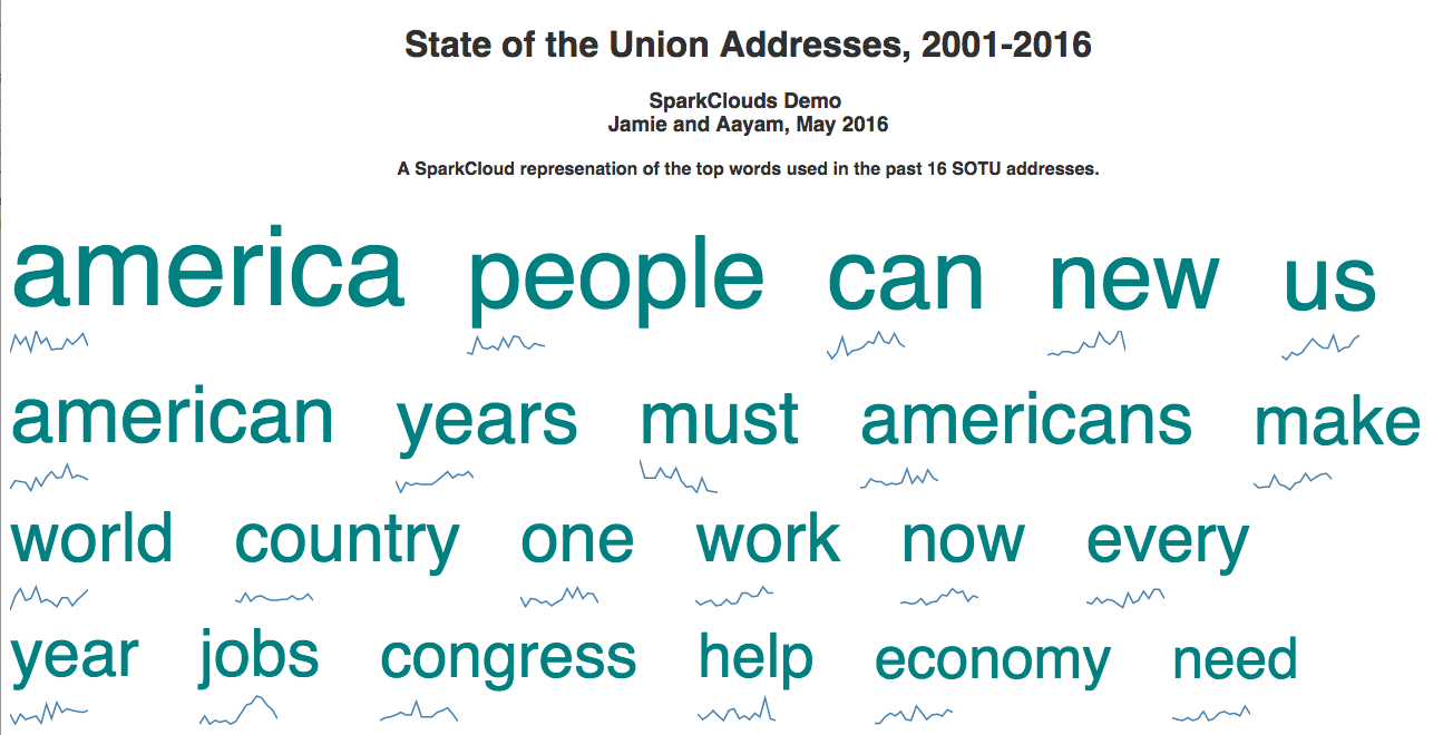
While SparkClouds are good for seeing trends in a tag-based dataset over time,
they're not great for diving into details about the dataset. One particular
example of when SparkClouds would
be very useful is
comparing State of the Union addresses over the years
and seeing how the most frequently used words have changed over time.
This gives us a big picture of how the
speeches might have changed to reflect time era, presidents, and policies.
Presentation
Browse our presentation for background information, alternatives considered
by the developers of SparkClouds, and pros and cons to the visualization
method.
Works Cited
- Lee, Bongshin, Nathalie Henry Riche, Amy K. Karlson, and Sheelash Carpendale.
"SparkClouds: Visualizing Trends in Tag Clouds." IEEE Trans. Visual.
Comput. Graphics IEEE Transactions on Visualization and Computer
Graphics 16.6 (2010): 1182-189. Web.
http://research.microsoft.com/en-us/um/people/nath/docs/sparkclouds_infovis2010.pdf,
Research Paper on SparkClouds
- https://en.wikipedia.org/wiki/Sparkline,
Wiki Article on SparkLines
- https://commons.wikimedia.org/w/index.php?curid=14491713,
WordCloud image
- http://research.microsoft.com/en-us/um/people/bongshin/,
Bongshin Lee
- http://research.microsoft.com/en-us/um/people/nath/,
Nathalie Henry Riche
- http://research.microsoft.com/en-us/um/redmond/groups/cue/karlson/karlson.htm,
Amy K. Karlson
- http://innovis.cpsc.ucalgary.ca/People/SheelaghCarpendale,
Sheelagh Carpendale